
EPL History, Part 4: National Diversity.
21 Mar 2019In my last post, I did a cleaning and preliminary exploration of the player data from FBref.com. After a few posts just cleaning and formatting the data, let’s get started looking at some interesting trends. (I know that I promised some Machine Learning this time, but I got side-tracked looking at the data this way, and it is very interesting.)
Recruiting Pool
Today, the EPL is considered one of the premier leagues in the world. It has international prestige, frequently discussed as one of (if not THE) top leagues for player salaries and competition level. Teams have the clout and finances to recruit players from around the world, but how has this shaped the game?
My goal today is to attempt to study the following questions:
- How has national origin of players evolved in EPL history?
- Were teams who recruited more international talent more successful?
This post will focus less on the python, but to recreate the things I show you need to use pandas, numpy, matplotlib, seaborn, and for an added bonus I made a few viz’s with Tableau Public. The jupyter notebook where I did these studies can be found here.
History of National Diversity in EPL
OK, one great thing about this EPL dataset is that it contains country codes for most of the players. These specify the nationality of the players, giving us a proxy for the breadth of the recruiting pool used by each team. By merging the player level data with squad data we can actually do some nationality studies really simply.
First, let’s drop players who weren’t very impactful on their teams. My bar for impact is still really low, simply that they have played more than one full match (90 minutes) for their teams:
df = df[df['minutes_pl'] > 90]
This cuts down our original 13,364 player-seasons to 12,129 player-seasons. Nothing dramatic, but a good way to remove players who only played a single game for a team that season. Everything in this post will use this requirement.
OK, let’s start our investigations of the recruiting pool by looking at the total number of nations represented in each season.
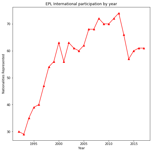
This is extremely interesting to me. In the first 5 years after the league was formed the number of nations represented basically doubled! Then it continued to increase through the 2000’s before levelling off again at a slightly lower level in recent years. I don’t have data to really investigate the causes for these trends but WOW the change between the early and later years striking.
Can we visualize these national trends easily? Actually yes!! I was recently introduced to Tableau Public, which is really cool. I did some pandas manipulation on the data, then I saved it to a CSV which I could quickly and easily upload. They have great geographical visualisations, and tools where you (yes you!) can play around with the data to see how things have evolved historically!
Further, I can embed the visualizations here! This “viz” has two tabs, one for a geographical representation, and another for the historical trend of each country. Feel free to play with the season specifiers on the right to look at individual seasons on the map. Or use second tab and the country selector to see the participation by year!
Clearly, there has not been a big shift in the total number of players in the league, yet the recruiting pool is increasing (Use the map to compare 1992 to 2017.)! This is also clear from the fraction of players from England decreasing so dramatically over 90’s (Use the National Participation Tab.).
Recruiting Pool for each squad
Let’s look at this a slightly different way. I wonder if this geographical expansion was uniform on all squads? We can use pandas to calculate the number of nationalities on each team-season quite simply (I won’t insert code much in this post, but I do here. Most other manipulations are along the same line.):
temp_list = []
for year in df['season'].unique():
    one_season = df[df['season'] == year]
    for squad in one_season['squad'].unique():
        one_squad = one_season[one_season['squad'] == squad]
        list_nations = []
        nations = one_squad['nationality'].apply(lambda x: str(x).split(",")).apply(pd.Series)
        #print(len(nations.columns))
        for col in nations.columns:
            list_nations.extend(nations[col].dropna().unique())
        unique = set(list_nations)
        if 'nan' in unique:
            unique.remove('nan')
        temp_list.append({'season':year,'squad':squad,'squad_nat':len(unique)})
temp_df = pd.DataFrame(temp_list)
Then seaborn’s boxplot should tell us something:
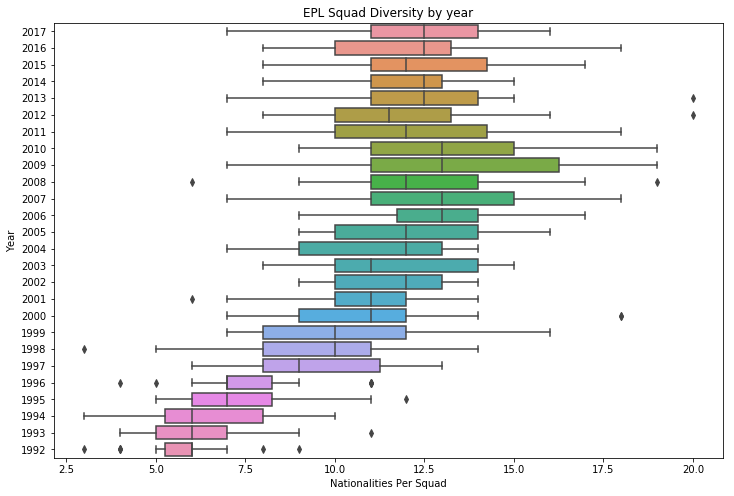
Using each season as a category and plotting the quartiles of the squad nationality counts shows that not only did the total number of nationalities in the league increase over time, that it was a general trend by all teams to become more international. In 1992, most teams had between 5 and 7 different nationalities. In 2002, most teams had 9 to 14 different nationalities.
While there is a clear trend towards larger recruiting pools for each team, there is also a widening spread between them. The whisker lengths on this plot are a good way to get an intuitive feeling, and it is clear that as the years progressed the teams had different emphasis (or success) on recruiting international players. The promotion / demotion system probably had something to do with this, as teams promoted from lower leagues have less finances and exposure to recruit talented international players.
Were teams who recruited more international tallent more successful?
Before I start talking about any of this. There is a ton of evidence that diversity is important and DOES lead to success. Take this recent article from Forbes as just one example. Nothing I am saying below is a critique of that established correlation.
I am trying to answer a simple limited, question:
Were teams who recruited from a larger recruiting area more successful in the league standings?
Intuitively, if a team can successfully recruit players from a larger recruiting area than their competitors, they should be able to out-perform them. A team of the best players from all Europe should have more talent than the best players from the UK.
We will use the number of nationalities per team-season as a measure of the recruiting area a team pulls from. However, we have already seen that this evolves quite significantly over the years. So we will “mean normalize” each season. (We simply subtract the mean number of nationalities per season from each team that season.) This gives us a measure of the relative recruiting area of each team that season.
We will use league points as the measure of success, we know it has worts but it is consistent within our dataset. A huge benefit is that league points is well behaved. It does not have a crazy range, or vary much between seasons so it is a nice variable to use. Like we have done before, we will calculate the number of points each team obtained that season:
df['Pts'] = df['wins'].apply(lambda x:x*3) + df['draws']
A simple seaborn.jointplot will tell us how well these are correlated:
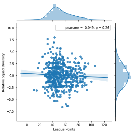
WOW!
It seems that there is actually no correlation! So the season point total of a team is not related to how many different nations they (successfully) recruited from. This seems to be against my intuition.
Not posted here, but did try a few other things:
- I tried to mean normalize the points in each season.
- I tried removing all mean normalization by season.
- I tried to normalize out the relative size of each squad.
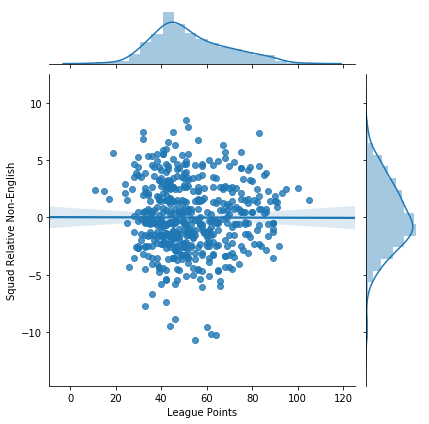
Another study I do want to post here reframes the question a bit. Instead of counting the number of countries represented as a measure of recruiting area, just count the number of non-English players. This asks the question a bit differently, it will increase emphasis on the number of international players (Still with respect to the rest of the league that season.) rather than the breadth of where the players come from.
Here I also see no correlation between the emphasis on international talent and league standing:
I cannot seem to answer my original question with the data I have. It may be possible by using converting the country codes into regional categories, or geographical distances. However, I am going to leave this problem here for now… With this strange and puzzling result. (It is really bugging me though.)
I can see no correlation between teams who recruited from a larger number of countries and EPL success.
Questions
- Have I missed something fundamental in my formulation of the problem?
- How would you treat different geographical regions? (e.g. Europe, South America, etc…)
- Is the EPL fundamentally flawed for this investigation? (e.g. They do have a ‘home grown player’ rule.)
- Tableau, Seaborn, any other cool visualization tools you think I should try out?